
OVERVIEW
Role: Graphic Designer
Services: Branding, Logo Design, Brand Kit
Brand tone: Nature-inspired, grounded, calming, authentic, reflective, welcoming
Inspiration for the design
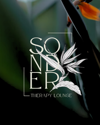
The Sonder Therapy Lounge logo reflects individuality and connection. The Bird of Paradise flower intertwines with the letterforms to symbolize growth and shared stories, while the framed arch represents new perspectives and possibilities. Together, these elements embody a supportive space for self-discovery, healing, and personal growth.
Soft Ivory
#e3e2d5
Warm Taupe
#a69f84
Olive
#373809
Deep Green
#272512
Terracotta
#845a34
Rich Clay
#753b21
Rooted & Lush
A nature-inspired identity that feels rooted, calm, and alive
A brand that grows from organic warmth and botanical depth, evoking the grounded richness of terracotta, moss, and forest greens. Balanced with modern neutrals, this palette embodies both stillness and vitality—calm yet expressive, minimal yet lush.

Inspriation
%20(18%20x%2035%20in)%20(18%20x%2024%20in)%20(24%20x%2018%20in)%20(2.png)
%20(18%20x%2035%20in)%20(18%20x%2024%20in)%20(24%20x%2018%20in)%20(2.png)


%20(18%20x%2035%20in).png)

%20(18%20x%2035%20in)%20(18%20x%2024%20in)%20(24%20x%2018%20in)%20(2.png)





Client testimonial
Working with Lauren was such a wonderful experience! She mapped out a clear timeline, kept me informed at every stage, and delivered exactly when she said she would. What impressed me most was her ability to truly listen and translate my ideas into a thoughtful brand identity that feels authentic, aligned, and beyond what I expected. I’m so grateful for her care, creativity, and professionalism. I highly recommend working with Lauren!