

OVERVIEW
Role: Volunteer UX Designer
Team: UX Designer, Lead product designer
Product: Toby for tabs
DESIGN PROBLEM
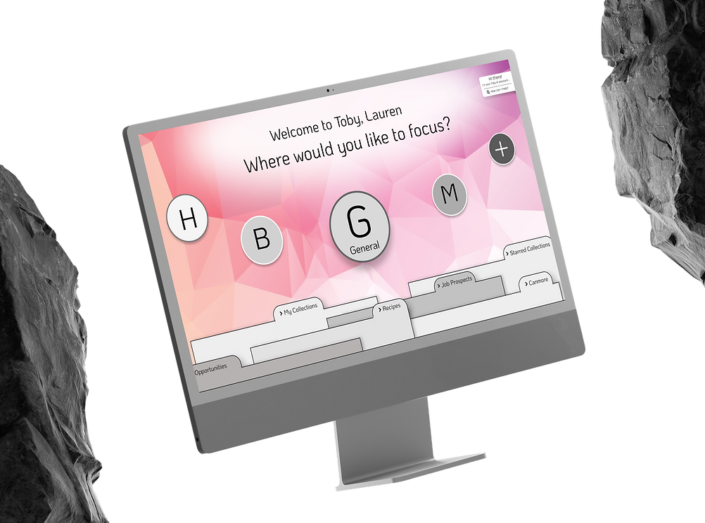
Redesign the Toby interface. Consider making it more intuitive, personalizable, and easy to use.
Original Design

How much we...
How might we design the Toby access page to help users quickly organize and reference their digital spaces in a way that feels natural and visually clear?
Identifying levers
Painpoint 1
Lever to pull:
Everything looks equally weighted
Hierarchy & Structure
Painpoint 3
Lever to pull
Some items feel buried or redundant
Space Optimization
Painpoint 2
Lever to pull:
It's hard to scan the menu quickly
Visual Clarity
Painpoint 4
Lever to pull:
The menu doesn't reflect how I use the product
Personalization
DESIGN


PASSING OFF
I shared the final design with the Toby team. While it wasn’t implemented immediately, an engineer later revived the concept for further discussion—a reminder that when volunteering your time, impactful ideas can take longer to gain traction.
LEARNINGS
Design is never in isolation.
The strongest improvements came when I listened to different perspectives—PMs thinking product-wide, UX designers pushing on accessibility, engineers flagging feasibility. True clarity came from balancing these voices.
Personalization was the breakthrough.
The last-minute pivot taught me to stay open to bold shifts, even late in the process. By centering on user needs, we turned a clutter problem into a scalable, user-driven framework. That leap reminded me that sometimes the biggest wins come from rethinking the problem itself.
Prioritization shapes outcomes as much as design does.
Having the project stalled in the backlog was frustrating, but it taught me that design impact depends on timing, resources, and alignment. A great solution isn’t enough—it needs a path to implementation.
